For completeness the article is now available in full below and will be updated over time.
The State of the Componentised Web blog post is now available on the Future Insights blog.
If you’re interested in attending FOWA London you can use the coupon code “BRJSFOWA15″ when signing up.
Introduction
The idea of building applications out of a number of independent components isn’t anything new. But with Web Components on the horizon I thought it would be a good time to look at component-based application development, how we benefit from taking this approach, how we can build our applications in this way using existing technologies and how we’re likely to be building our front-end web apps in the future.
What are Components?
Software development is a field that suffers from a considerable amount of semantic overload (terms that can have more than one meaning). “Component” is clearly very generic so it makes sense to qualify what we mean when we talk about them in the context of front-end web apps.
A component within a front-end web app is a piece of software that has generally been designed and built to work within a larger application. A component can be represented within an application in a number of ways. It may have a UI (User Interface) or may be purely logical and could be throught of as more of a “service”.
UI components are easier to comprehend because there is a visual representation. Buttons, input boxes and textareas are nice simple examples. The hamburger menu button (whether you like it or not), tabs, calendars, a tab menu or even a rich text WYSIWIG editor can be considered to be more advanced examples.
Components that offer service-type functionality can be more difficult to get your head around. Examples may include cross-browser AJAX functionality, logging or one that offers some form of data persistence.
An important part of compontent-based development is that components can be composed out of other components. The rich text editor is a great example of this since it will be composed out of buttons, drop downs, some sort of rich view and so on. Another good example is the HTML5 video element which again contains buttons and also an element which renders content from a video data stream.
Why Build Components?
Now that we have a good idea of what exactly we mean by component we should take a look at the benefits of building front-end apps in a component-based way.
Modular
You may come across helpful phrases like Components are inherently modular. Well, thanks for that!
There’s that overloading of terms again. You could argue that the term “Component” better fits the idea of the UI and “Module” may be suited to logical functionality, such as that provided by a service. For me, modules and components are near-synonyms; the offer a way of grouping, focusing and encapsulating everything that is related to a unit of functionality.
High Cohesion
Another ticked checkbox in the software engineering buzzword (term) bingo! We are grouping and encapsulating everything related to a piece of functionality. In the case of components this can be the functional logic and assets; JavaScript, HTML, CSS, Images etc. This is precisely what we mean be cohesion.
Doing this makes maintaining a component much easier and in doing so increases reliablity. It also keeps the component focused, increasing the likelihood that it will be reusable.
Reusable
When you see example components – particularly Web Component examples – the focus will be very much on reuse. Having a focused module with a clean and easy to understand API naturally encourages reuse. By building reusable components we adhere to the DRY (Don’t Repeat Yourself) principle and all the benefits it provides.
A word of warning: Don’t focus too much on trying to build reusable components. Focus on building the required piece of functionality for your application, which may be very specific. Then, if the need arises, or it becomes very clear that the component is reusable, put in the extra effort to make the component reusable. As developers love to create reusable functionality (libraries, components, modules, plugins etc.). Doing so prematurely can result in a world of pain. So, take all the other benefits of component-based development and accept that not everything you write can be 100% reusable.
Interchangable
A nice and focused component API presents the opportunity to be able to easily change the underlying implementation. Or, if the components within the application are loosely coupled you can actually completely swap one component for another as long as they offer the same API/interface/contract.
For example, if you were to use a service component that offered realtime functionality via GoInstant, the news this week that they’re closing down would probably be a bit of shock. However, you could quite feasibly create and use a FirebaseComponent or PubNubComponent as long as they offer the same data synchronisation-focused API.
Composable
As previously discussed, a component-based architecture makes it easy for one component to be composed of a number of other components. This allows the component to stay focused and benefit from reusing functionality already build and exposed in other components.
More complex functionality can be built in this way; from richer application features to full applications. It’s one of the main benefits of this approach.
Whether absolutely everything should be a component is really up to you. There’s no reason why your application can’t be a my-app component which is then composed of my-awesome-feature and my-fabulous-features. And those components are then in turn composed of other components. If you see benefits from this approach then by all means stick with it. However, be careful not to over complicate things in the same way that you shouldn’t focus too hard on making a component reusable. Focus on delivering application functionality.
Building Components Now
At Caplin Systems we use a number of practices and principles when building our component-based applications. These are supported by the BladeRunnerJS (BRJS) open source toolkit. It’s called “BladeRunnerJS” because we encapsulate application features within something we call Blades. Blades are application features that can be reused within the application, but aren’t reusable across applications. When a feature becomes truly generic we shift the definition into a library to be used across applications. Application-specific components (blades) and generic components within our apps can be defined using any library and framework we feel suits the feature we’re building best.
So, what libraries and frameworks exist that can help us build components?
Just take a look at the ever-popular TodoMVC site and you’ll see there are a vast number of front-end libraries and frameworks to choose from when making a decision on what technology to use when building your app. You could argue that any of these solutions can be used to build a component-based application. However, some of them come with in-built Component functionality. The most popular of these include AngularJS, Ember and React.
How do Components Communicate with Each Other?
Before we dive into the examples it’s worth briefly mentioning inter-component communication. If these components are “independent” and “modular” how do they communicate with each other?
The obvious solution is to make components directly reference each other and interact via their API. The problem with this is that you introduce a direct dependency between components. In the short-term this can be fine. But over time your application may start to creak as you try to make changes; changing one component has an unexpected knock-on effect with another component. The decision to remove a component that isn’t delivering the product value you expected can result in your app breaking because one or more other components relied on it.
The solution here is loose coupling where components have little or no knowledge of each other. They don’t directly create other components and when they need to communicate they do so through interfaces/contracts or via services. We’ve thought a lot about this when building BRJS apps and we use a ServiceRegistry to access services that are used for inter-component communication or to interact with resources such as Web APIs. Solutions like Angular and Ember use services and Dependency Injection for this.
my-avatar Example Component
To demonstrate the very basics of how each of theses libraries and frameworks allow us to build components we’ll build a simple example with a UI that fetches and displays a user’s avatar. The component, where possible, will have the tag my-avatar and will fetch an avatar based on two attributes:
servicewhich will allow a service to be set e.g.twitterorfacebookusernamewhich identifies the user that we wish to fetch the avatar for
AngularJS
AngularJS is probably the most popular front-end solution for building apps right now. The creators – Google – took the approach of thinking about how HTML would look if it were re-invented to address the needs of the web as they are now.
Components can be defined in Angular using custom directives. Directives then allow you to declare custom components within your HTML markup.
This example demonstrate how simple it can be to use Angular directives. The scope values define the attributes that are used from the my-avatar element and those attributes are then used when building the underlying image tag that is rendered and shows the user’s avatar.
As you can see, the HTML looks as follows:
<my-avatar service="twitter" username="leggetter" />
Ember
There’s an ongoing debate about frameworks v libraries, where in some circles frameworks are seen as forcing you to work in particular ways and are therefore evil. Well, Angular is clearly a framework and Yehuda Katz and Tom Dale – the developers behind Ember – are also happy to call Ember a framework.
Ember has in-built support for what it aptly calls Components. The idea behind Ember Components is to align as much as possible with Web Components so that they can be migrated to native Web Components when browser support permits.
The example below uses handlebars for templating so the element definition doesn’t follow the exact same syntax:
<script type="text/x-handlebars">
  {{my-avatar service="twitter" username="leggetter"}}
</script>
React
React is the new kid on the block but has already gained a significant following. It’s developed by Facebook and is used for the full Instagram UI and some of the Facebook UI.
The recommended approach to building components using React is to define them using something called JSX. This is a “JavaScript XML syntax transform recommended for use with React”. Don’t let this put you off. As they point out in the docs the idea is to allow HTML markup within a JavaScript structure to help you visualise.
As far as I can tell you can’t add markup directly to HTML and you have to create your component using JSX too. But, once you’ve defined a component you can then create other components that use it (composition).
So, the syntax for declaring using the component requires an HTML element and a call to React.RenderComponent e.g.
<div id="avatar"></div>
<script>
  React.renderComponent(
    <MyAvatar service="twitter" username="leggetter" />,
    document.getElementById('avatar')
  );
</script>
The Future: Web Components & Beyond
Web Components are the future! As the name suggests they promise to deliver native browser support for building components that can encapsulate functionality.
I’ll provide a brief overview of Web Components below and demonstrate how we can start using them now. For a deeper dive please see the Resources section at the end of this post.
The functionality they provide includes:
Custom Elements
In the examples above that used Angular, Ember and React we focused on building the my-avatar component. Where possible this was represented as a custom element that we added to the page or template markup. Web Components includes native support for this via Custom Elements – an absolutely fundamental part of the Web Component specification.
Part of defining new elements includes access to element lifecycle events such as when it is created (createdCallback), when it’s attached from the DOM (attachedCallback), when it detaches from the DOM (detachedCallback) and when element attributes change (attributeChangedCallback(attrName, oldVal, newVal)).
An important part of Custom Elements is the ability to extend the functionality offered by an existing element and in doing so inherit its functionality. In our examples below we’ll extend the img elemnet.
Ultimately what Custom Elements are doing, and what we tend to do when we write modular code, is abstracting away complexity to enable the users of the component to focus on getting value from using an element and build richer functionality.
Shadow DOM
Remember IFRAMES? Many of us still use them because they ensure JavaScript and CSS from a widget or component don’t leak into a page. The Shadow DOM provides this scope protection without the baggage that comes with IFRAMES. The official line on this is:
Shadow DOM is designed to provide encapsulation by hiding DOM subtrees under shadow roots. It provides a method of establishing and maintaining functional boundaries between DOM trees and how these trees interact with each other within a document, thus enabling better functional encapsulation within the DOM.
HTML Imports
We’ve been able to import JavaScript and CSS for a long time. HTML Imports give us the ability to include and reuse HTML documents in other HTML documents. The simplicity also means it’s easy for us to build components composed from other components.
Finally, the format is ideally suited for reusability and distribution through your favourited package management solution (e.g. bower, npm or Component).
Templates
Many of us already use solutions like handlebars (that we used in the Ember example, above), mustache or underscore.js templating. Web Components adds native support for Templates via a template element.
Native templates allow you to declare fragments of markup which are parsed as HTML but classed as being “hidden DOM”. They go unused at page load, but can be instantiated later on at runtime. They are queryable and won’t load any related assets until they are inserted into active DOM.
Platform.js
But – as per usual – we’re not quite in the position to be able to use them as browser support isn’t there yet.
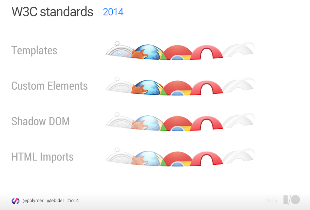
Web Component Browser support as of 27 Jun 2014
But – also as per usual – we can start using some of the functionality that Web Components offer through the magic of polyfills.
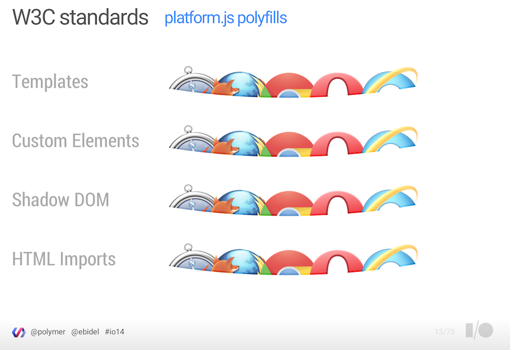
Web Component Browser support thanks to Polyfills
The great news here is that the two most progressive browser vendors, Google and Mozilla, are working together on a polyfill to help us build Web Components now.
The example below uses platform.js and demonstrates how the my-avatar element can be defined as an extension of the img element. The fantastic thing about this is that it therefore picks up all the functionality of the native image element, such as accessability.
Take a look at the HTML5 Rocks Custom Elements tutorial for much more information on create Custom Elements.
Note: If the platform.js interests you then also take a look at bosonic.
The purpose of native technology support is to offer a base for us to build on top of. So Web Components don’t signal the end for libraries and frameworks.
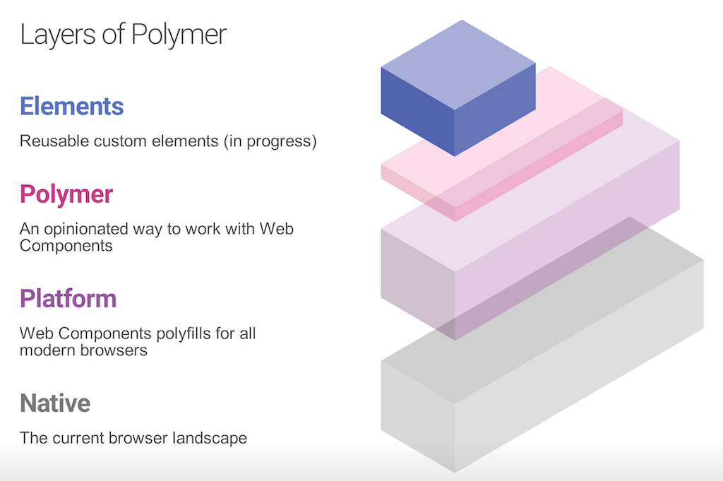
Polymer
Polymer is the perfect example to demonstrate building on top of native Web Component functionality. It provides an opinionated simplified mechanism for creating custom Polymer elements and provides a number of core and UI (Paper) components for you to build your applications upon.
Below you can see how the simple my-avatar is easily achieved and we get to use our preferred markup too.
Google are really pushing Polymer. Check out the Polymer getting started guide for a hands-on example.
X-Tag & Brick
Mozilla have developed their own Custom Element polyfill called X-Tag. X-Tag is a library that polyfills several features that enable Web Components in the browser and it will soon provide full Web Component support.
Here’s the my-avatar Custom Component created using X-Tag – it’s very similar to the defined specification:
Mozilla have also created a library called Brick which includes X-Tag and provides “a collection of UI components designed for the easy and quick building of web application UIs” in a similar way to what Google are looking to offer with Polymer.
Conclusion
There are lots of benefits to building applications with component-based architectures and you can tell from the approach that existing frameworks have taken and from Web Components that it’s recommended when building front-end web apps.
This whirlwind tour of the State of the Componentised Web has likely added to the weight of choice we developers already have when it comes to frameworks and tooling. But, Web Components may be the light at the end of the tunnel!
Web Components will provide a native and unified way of building applications. Existing frameworks will likely move to use Web Components or demonstrate how they can be used alongside them. Ember’s strategy is to make it easy to migrate to Web Components and Facebook’s React is a good example of where integration is most likely – there’s already a ReactiveElements that demonstrates this. Since Angular and Polymer are Google projects it’s also highly likely that these two projects will align.
Resources
- Eric Bidelman – Google I/O 2014 – Polymer and Web Components change everything you know about Web development
- Ryan Seddon – Web Directions – Web Components, The Future of Web Development
- Addy Osmani – LXJS – Componentize The Web: Back To The Browser!
- WebComponents.org
a place to discuss and evolve web component best-practices
